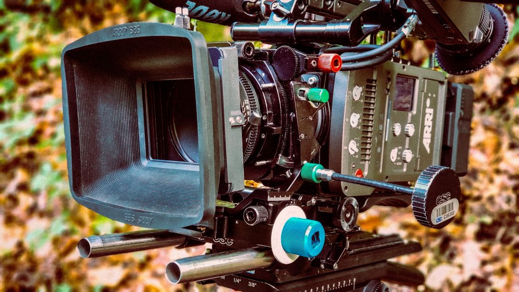
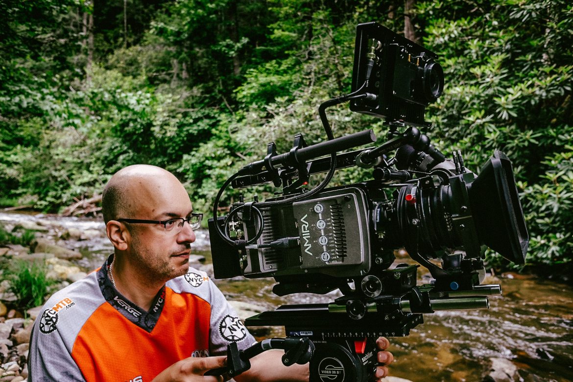
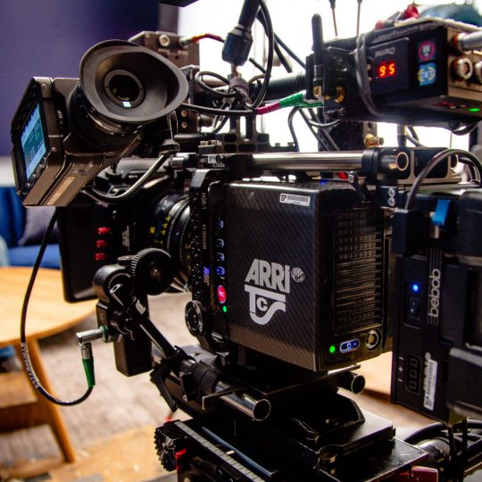
I have been having a blast with the Arri Shift & Tilt lens system lately. This system was very popular when I was getting started in the biz in the late 1990’s. I would say that it was a given that almost every music video camera package had a set of these. They were almost as common as ND filters! The shift & tilt system eventually fell out of flavor and many young folks only know this look as an Instagram or Photoshop effect, but this is where it all started.
The basic look is having some objects sharp and in focus, while other objects that are on the same plane of focus are soft. Normally objects that are on the same plane of focus are equally sharp. For example, if you stand directly in front of a wall and focus on it, anything on that wall will be in focus. But if you TILT the lens, it will no longer project the image flat on the sensor (or film) causing part of the wall to be in focus and throwing the other part out of focus. This can be achieved because the lens is on a bellows system which allows it to move in relation to the sensor. Here you can see that the camera is pointed up, while the lens is pointed down which throws the top or bottom of the frame out of focus.
The SHIFT part comes into play when you slide the lens left & right or up & down in relation to the sensor while keeping it parallel with the sensor. This affects the perspective and was originally used by architectural photographers to straighten the vertical lines in the image so when looking up at a building it doesn’t appear to be falling backwards like it does with a normal lens.
By manipulating the tilt (or swing) and shift of the lens, you can come up with some cool looks if the subject matter calls for it. I will dig out an example of something I shot with a shift & tilt for my next post so stay tuned! .


Sorry, the comment form is closed at this time.